
Monday, 23 June 2014
REDO OF ADVERT 1
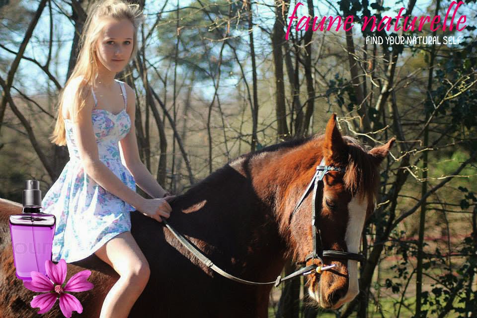
I re-did my advert 1 as I wasn't that satisfied with the original, this is my new advert that I will be using for advert 1.

Tuesday, 17 June 2014
SPY KIDS
Q1:
Explain two ways why the narrative (characters and events) in the extract fits the action and adventure genre.
Use examples from the extract.
Spy Kids is a typical spy action and adventure film for children. It includes narrative conventions which suit the action and adventure genre, this includes conventions such as spectacle. This is especially highlighted when the mother receives the ring box up the Eiffel Tower as it is precisely slid along the rail into her grasp and fireworks go off. The scene is very spectacular because they are at the top of the Eiffel Tower with a beautiful view of Paris, the city of love and life, this therefore connotes love. The fireworks look beautiful and are witnessed from an incredible view. The spectacle is created because it is a very grand and romantic gesture of proposal and is based in a romantic setting.
A second convention in the extract is combat and conflict, for example when the helicopters fly through the wedding in an attempt to attack the two spies and stop them from getting married. They are shown as the antagonistic because they ambush the wedding and force the protagonists Gregorio and Ingrid to flee in an attempt to save their lives. The scene shows clear combat and conflict because there an obvious two sides, good vs. evil, and the protagonists need to flee to avoid possible death.
The characters also fit the action and adventure genre because there is a clear antagonist and protagonist. The story is told from the mothers point of view and she is the narrative background voice which explains the story and the characters feelings, which automatically positions the audience in a position of understanding and encourages them to feel sympathetic to her. This means she is positioned as the hero, a typical character in action and adventure films.
Explain two ways why the narrative (characters and events) in the extract fits the action and adventure genre.
Use examples from the extract.
Spy Kids is a typical spy action and adventure film for children. It includes narrative conventions which suit the action and adventure genre, this includes conventions such as spectacle. This is especially highlighted when the mother receives the ring box up the Eiffel Tower as it is precisely slid along the rail into her grasp and fireworks go off. The scene is very spectacular because they are at the top of the Eiffel Tower with a beautiful view of Paris, the city of love and life, this therefore connotes love. The fireworks look beautiful and are witnessed from an incredible view. The spectacle is created because it is a very grand and romantic gesture of proposal and is based in a romantic setting.
A second convention in the extract is combat and conflict, for example when the helicopters fly through the wedding in an attempt to attack the two spies and stop them from getting married. They are shown as the antagonistic because they ambush the wedding and force the protagonists Gregorio and Ingrid to flee in an attempt to save their lives. The scene shows clear combat and conflict because there an obvious two sides, good vs. evil, and the protagonists need to flee to avoid possible death.
The characters also fit the action and adventure genre because there is a clear antagonist and protagonist. The story is told from the mothers point of view and she is the narrative background voice which explains the story and the characters feelings, which automatically positions the audience in a position of understanding and encourages them to feel sympathetic to her. This means she is positioned as the hero, a typical character in action and adventure films.
Tuesday, 20 May 2014
SPIDERMAN
Identify two ways in which the narrative in the extract fit
the AA genre?
The Superman extract is a typical adventure superhero
extract. It give the audience a clear understanding of the speed and motion
used in the extract which is a part of the AA genre. Within the short clip was
a police chase in which the police force were chasing a car which inside was a
criminal who had shot down Spiderman’s uncle in attempt of hit and run, leaving
the uncle dead. The use of camera angles such as the panoramic angle lets the
audience feel a part of the chase and allows them to witness the pace of the
chase. This creates suspense also as it encourages the audience to feel excited
in this intense chase. My second example of speed and motion is when Spiderman
swings from different buildings on the intensely fine webbing that he fires
from his fingertips. He is swinging at such a fast pace but is pictured as an
amateur/beginner as he makes mistakes, this tells us that it could be his first
time trying this act. This then creates suspense and jeopardy as there is a possibility
he may fall and kill/injure himself.
We can clearly tell the characters apart and identify who is
the protagonist and the antagonist. We can tell Spiderman is the protagonist as
he is pictures as the hero, we can see the villain who killed Spiderman’s uncle
is the antagonist as he is the villain. We can identify Spiderman as the hero
as he does not commit acts of violence and seems to be acting for the greater
good. For example in this situation he is trying to capture the criminal who committed
the crime on his uncle. This is stereotypically the roll of the hero as he
captures the criminals. Due to Spiderman being a superhero it must mean that he
has superpowers. Spiderman’s powers are that he is able to shoot webs which
enable him to swing from buildings, like a spider. Having these powers are a
key code of a classic superhero AA movie.
SOCIAL STEREOTYPES- WHAT I LEARNT
I learnt that a stereotype is a fixed, over generalized
belief about a particular group or class of people. Examples of this may
include a homeless man wearing old, dirty and ratty clothes. I also learnt that
there are also advantages to stereotypes as I thought overall it was all
negative. I learnt that an advantage of stereotypes is that it enables us to
respond rapidly to situations because we may have had a similar experience
before. However there is also a disadvantage that it is harder for us to
recognise individuals. I learnt that by stereotyping we infer that a person has
a whole range of characteristics and abilities that we assume all members of
that group have. Stereotypes lead to social categorization, which is one of the
reasons for people becoming prejudice.
Monday, 19 May 2014
MEDIA ESSAY
A comparison of how woman and children are represented in
fragrance advertisement from the 1920s, 1990s and 2013
I have chosen to compare three advertisements than
span nine decades: Evening In Paris (print 1920s), Lovestruck (print
1990s) and Dior Homme with
Robert Patterson (moving image 2013).
The
thing that shocked me most and stood out most was how elegant, discrete and
sophisticated the women were in the 1920’s when the advert I analysed was done
in paint compared to now where women are represented in 2010 as openly alluring
and unsubtle with their actions.
Evening in Paris (1920
print Bourjois)
 My first
advertisement Evening in Paris was
produced just after WW1 had ended and therefore it is not surprising that it
depicts a handsome uniformed officer; equally, the period shapes the
representation of a woman whose main aim would be to secure an eligible man to
marry. The woman is positioned in a conventional way in that she is held by a
man in a passionate embrace with the focus on her delicate femininity and his
powerful masculinity.
My first
advertisement Evening in Paris was
produced just after WW1 had ended and therefore it is not surprising that it
depicts a handsome uniformed officer; equally, the period shapes the
representation of a woman whose main aim would be to secure an eligible man to
marry. The woman is positioned in a conventional way in that she is held by a
man in a passionate embrace with the focus on her delicate femininity and his
powerful masculinity.
The
man is represented as a foil as we do not even see his face. What is important
about him is that he is in military uniform which constructs him as a very
masculine man, which might have been important in an advertisement made only
two years after war ended. Nevertheless, however commanding he is, he is
nonetheless in the lady’s power, which conveys the idea that if you wear
Bourjois perfume, you would have a very attractive young man in a uniform
devoted to you. This is a very good advertising idea as many people of the
public see men in uniforms to be much more attractive than they actually are as
they picture a masculine man who is in control.
The woman’s posture is a
visual code for her femininity. She is leaning back and is pictured as the more
fragile of the two as she is clasping on and depending on the males strength
and masculinity. Also the male is the eager one of the two as he is coming on
to her yet she seems to be clasping on. This could also hint to the period of
where females had a desire to marry and have a family, therefore they would not
be as defensive if a man came onto them then of the modern time where it would
be seen as to forward if a man came on to a woman in the same way.
She is depicted as having
porcelain white skin which is a sign of beauty and being pretty, in many
nations have white skin is a sign of beauty and is pictured as very gorgeous.
As with the red nails and lipstick the colours really contrast against her
white and pure skin. Red is stereo-typically the sign of love which could be a
sign of either her feelings towards to male character or that she is looking
for love. Red is also a sign of beauty and having red nails and lipstick is
stereo-typically rather sexy and attractive to the male generation. She has flowers
woven into her perfect blonde hair which once again is a sign of beauty; it
also tells us about the period where woman do not have jobs, so therefore they
have a lot of free-time. It seems in her free time she is focusing on
beautifying herself for her male partner and is going to the extent of weaving
flowers into her hair which takes a long time.
The advert overall gives out
the message that if you wear Bourjois perfume then when your male partner comes
home he won’t be able to take his hands of you or resist you.
 Lovestruck (1990
print Vera Wang)
Lovestruck (1990
print Vera Wang)My second advert is ‘Love struck’ by Vera Wang. Firstly this is a traditional Romeo and Juliet based balcony scene, it features the woman standing on the balcony whilst the male is looking adoringly up at her. This can be pictured as attractive to woman because most woman desire a male who treats them right. I took a liking to this advert because it is not a stereotypical advert where the woman is attending to all the male’s needs. In this advert the man is attending to the woman, as well as the woman is positioned higher than the male which shows manners of importance. It is telling us that because she is at a higher point that she is the more respected of the two and that all attention should be on her. It is showing that in this advert the female is more important than the male.
The female character is dressed in a beautiful
purple gown; she has brown natural hair and a very pretty face. However the
male is dressed in black. I feel this contrast’s against the purple and he is
wearing black so that the attention is on the female. If this is a feminine
perfume they do not want all the attention to be on the male. They do not want
him to over-ride the female who is pictured as the dominant of the two. Secondly
the adverts main theme is flowers. There is a purple flower placed on the
perfume lid which is of the same colour as the dress and the brand name. As
well as this the male is holding some purple/pink flowers. This tells us that
the brand is feminine and directed at females. It includes a very girly theme.
The
female character’s hair flows loose as well as she has her arms and shoulders
on display. This shows us that she is not conservative, married or formal. It
tells us that she is free, single and wanting the attraction of the male. We
can tell a lot from an advert just from her hair because it could also hint at the fact that the
perfume could make her feel young and free. The
title ‘Lovestruck’ ties in very well with the theme of the perfume as it
portrays the male who is positively ‘Lovestruck’ over this gorgeous female.
(2013 Dior Homme with Robert Patterson)
For my third advert and
final fragrance advertisement I chose the moving image of ‘Uncensored official
director’s cuts’ by Dior Homme which aired in 2013 and is starred by Robert
Patterson. I chose this advert because it is very different to the other two
adverts I had chosen. Firstly it is a male perfume and this gives a very
different reaction to the advert. The adverts message is along the lines of
that if you wear Dior then you will become as ‘cool’ and ‘good-looking’ as
Robert Patterson and will break all the rules and who attracts gorgeous blonde
girls. The whole advert is filmed in black and white. This gives a retro, urban
and classic effect on the advert, this really ties in with his clothing,
expressions and body language which give a ‘cool’ effect.
 The man in this
screenshot is positioned in a very 'cool' position, as if he has no care in the
world, he does not obey the rules hence him sitting on the roof with his shades
on. Yet however he is in a suit, this could show that he could be quite important
yet he does not obey the rules. The advert is in black and white, to add the
'cool' effect and to enhance his actions. This screenshot is the opening scene.
They have straight away positioned Robert Patterson in this way because its eye
capturing, boys would see this and think 'hang on I want to be like him, what I
can do to be like him'. The model is presenting himself in a very 'I don't care
about anything' position. His legs are not perfectly together they are spread
apart and his body position is slumped, hence giving this effect. The brand is
offering boys the chance to be like Robert Patterson and that if you buy this
perfume you will become like him. The brands message is similar.
The man in this
screenshot is positioned in a very 'cool' position, as if he has no care in the
world, he does not obey the rules hence him sitting on the roof with his shades
on. Yet however he is in a suit, this could show that he could be quite important
yet he does not obey the rules. The advert is in black and white, to add the
'cool' effect and to enhance his actions. This screenshot is the opening scene.
They have straight away positioned Robert Patterson in this way because its eye
capturing, boys would see this and think 'hang on I want to be like him, what I
can do to be like him'. The model is presenting himself in a very 'I don't care
about anything' position. His legs are not perfectly together they are spread
apart and his body position is slumped, hence giving this effect. The brand is
offering boys the chance to be like Robert Patterson and that if you buy this
perfume you will become like him. The brands message is similar.
 In this image the man
is positioned dancing with a girl, they are messing around and they are falling
in love. The key code is definitely that he is attracting many girls; this one
in particular is the typical gorgeous blonde girl. This is giving the image
that if you wear the fragrance you will attract many gorgeous girls and fall in
love. The brand is promising boys that they will get many girls attracted to
them with this fragrance, the message is the same.
In this image the man
is positioned dancing with a girl, they are messing around and they are falling
in love. The key code is definitely that he is attracting many girls; this one
in particular is the typical gorgeous blonde girl. This is giving the image
that if you wear the fragrance you will attract many gorgeous girls and fall in
love. The brand is promising boys that they will get many girls attracted to
them with this fragrance, the message is the same.
This is one of my favourite
scenes. It shows the man running on the roof and the woman below. Firstly it
gives a sense of freedom and adrenalin. That this man could do anything he
wanted because he was wearing Dior. Then the woman is positioned below the man.
The main view is the man and this gives the effect that you are better then
everyone and you are the alpha male if you were wearing Dior. This scene gives
you this feeling that you want to be a part of what they are doing. You want to
be in Robert Patterson's place, this may affect people’s decision on buying the
product because they want to be free and be able to run on roof tops with
beautiful girls. This is the message and idea of this scene in the advert. It
makes people want to buy Dior fragrance for men.
In conclusion, my earliest advert shows women as refined whereas in my
modern advert they go out to get what they want.
Thursday, 3 April 2014
Advert
Thursday, 27 March 2014
PHOTOSHOP

Subscribe to:
Posts (Atom)