
Thursday, 27 March 2014
PHOTOSHOP
Wednesday, 19 March 2014
PHOTOGRAPHY
So I had a friend take some of these photos of me, I am not quite sure out of the millions there are but I thought I would post some to show you the general theme. I am still unsure on which is my favourite. I used a floral dress with no helmet or saddle, this goes with my theme of being free, my other photos include me standing or sitting next to or on the horse.


Thursday, 13 March 2014
Photography Ideas

These are some of my ideas for one of my adverts. In the photo above I was thinking of placing something happy like a pretty girl or a couple or something that makes people happy, then I would caption it 'Happiness is through a horses ears' or something similar.
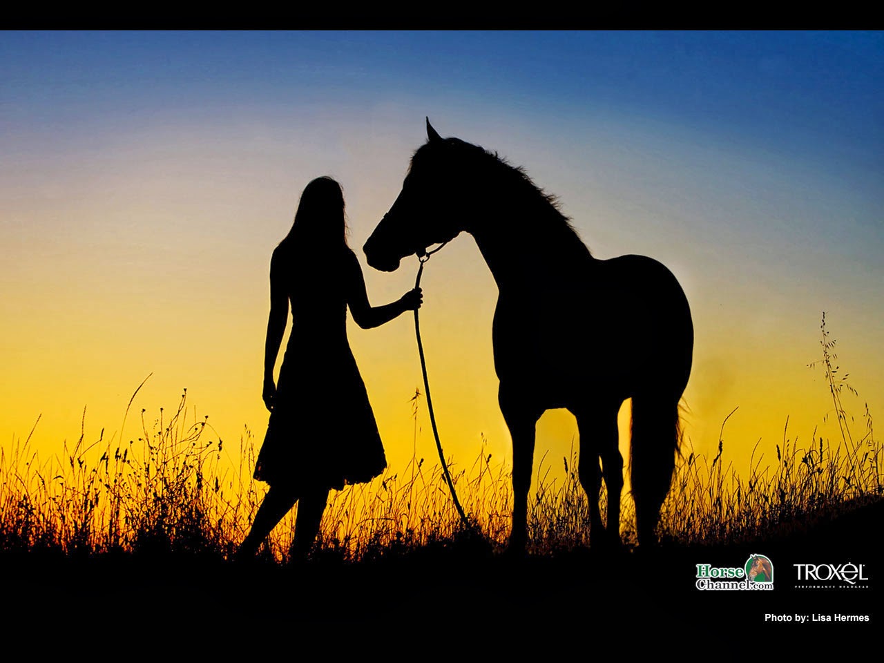
I thought recently with the warm weather this photo could be a nice one! With the late evenings and the beautiful contrast between the sunset and the blacked out features it really drew my attention and is beautiful!

Again the blacked out features really caught my attention in this photo, of course I don't have the resources of the sea but it could be easily replaced with a lake or field.

Again the blacked out features are beautiful against the colours of the sunset, I like this because there is a lot of space where you could put your fragrance.

I love the 'bokeh' effect in this photo, its really focused on a certain point and is very beautiful with detail- as well as having a nice space for the fragrance.

I love this photo because it really shows love, the black and white is of a lovely standard and really professional.

This is of an advert for horse photography, I love the 'bokeh' effect and I really think it focusses you on one really basic but beautiful part on the horse which is the eye.

Again I love the blacked out effect on the horse and how it contrasts nicely with the white cloudiness of the sky, as well as white space to place the fragrance.

Although un-original I am drawn to this one because it shows love and respect in both animal and human and could go really nicely as a fragrance advert.

This was one of my original options, I love the scenery and layout. It really is eye-capturing.

Again with this photo there is a lot of white space to place my fragrance and it is really beautiful.


These two are of similar ideas, I love the scenery and background and they are very inspirational

This is one of my favourite because it can tie in with a theme of being 'free' it is of a beautiful standard and shows how majestic and powerful the animal is.

I love this because it is different. I love how the an is placed underneath and their is space for the fragrance.

I love the 'bokeh' effect on this photo. It is focussed on the horse and there is space for the fragrance.

This is also very different. Instead of focussing on the eye it is focusing on the muzzle, with space for the fragrance it can look very professional and free.

This is an example of an advert used with a horse. I think it really gives that free effect.


In these three photos above we have the sunset type, I love the contrasting colours and especially in the last where the sun is coming through the horses legs.

This is natural and free-like. It really stands out to me.

This is one of my favourites. Like the other one it shows the powerfulness in the horse and ties in with the theme of being free.

This is my final example. The white horse ties in with the darkened background and gives the message theirs always light in the darkest of times. It really stands out to me.
Tuesday, 11 March 2014
HERO AA SCENE
We watch the AA exam
extract from Hero and analyse it using the exam questions:
- mise-en-scene,
camerawork, sound and editing
In the AA exam
extract from ‘Hero’ the close-ups were the shots that really caught my eye, it
was constantly flickering between Jet Li and Donnie Yen’s aces. This was to
build tension and capture all reactions that these characters would be feeling
just before their big fight. It deepens the scene because we get a closer look
at the detail on their faces as if we were really there, it makes their emotions
feel real and more visible which means the audience are able to experience the
scene and relate to the characters easier.
The piece of sound
and editing that caught my eye was the sounds that the weapons made. It had a
metallic sound when they came into contact with each other which would ring out
and echo out. This allows for the audience to become more involved into the
scene, they have put emphasis on the weaponry because they are highlighting the
beautifulness of these weapons. The noise is loud so that it is noticeable for
the audience and the audience can engage in the scene.
The piece of
mise-en-scene that caught my eye was the weaponry that the two characters were
using. They were clean, shiny, broad and beautiful. They glinted and shined
which attracts the audience attention and you can tell that they had been
craved and suited for situations like this fight which is about to happen. They
are cultural and very stereo-typical sword that is used in old-fashioned typed
fights and wars.
Subscribe to:
Posts (Atom)