In this advert I made the effects and features of the girl and the horse more sharper to enhance any features that were blurred and to make the photo look more professional. I also used pink and white text accompanied by a pink perfume bottle and a flower because it accompanies the colours of the dress.
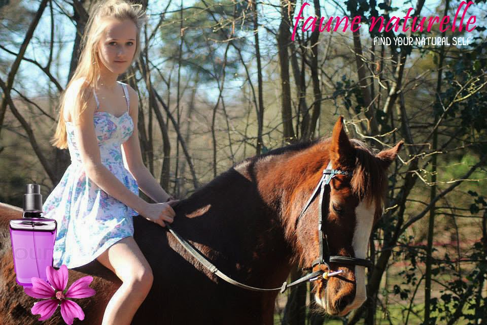
The girl looks good but the light falling on the horse puts his neck in a lot of shadow and makes it look quite heavy.
ReplyDeleteThe other on is better in every way, in my view. what do you think?
ReplyDeleteWhere are your preps on Spiderman and the comparative essay?